A case study on responsive webdesign
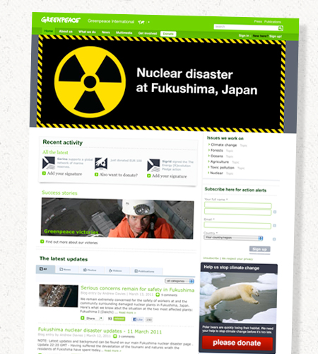
Choosing a “liquid” design or a “static” design in most cases refers to the width of a website. Either the width is fixed or it adjusts to the size of the window viewed in. Although this seems like a detail this decision is fundamental to every other part of styling a website.
Using the Greenpeace International website as an example this case study illustrates how liquid design practices lead to an improvement in other areas such as Accessibility, Usability and UX. Another case in which liquid design can achieve better results than static design is when developing websites for handheld devices.
Death to all pixels
The advantage of standards
Print designers have the advantage over screen designers that the viewer of their creation can hardly have an impact on the colors, the grid, the typography or the format of the design. That's one of the reasons why even great designers suddenly feel uncomfortable when they have to work for screens. As I used to work as print designer as well before switching to web I can really understand how it feels to “lose control” over your design.
Almost as a natural reaction to this loss of control I did what most designers in this situation would do: I tried to find a standard I could use to force users to see the design the way I intended it to look like. The result is a “static” design with a fixed width using the pixel unit.
The truth is that there is no such standard – even pixels don't look the same on every screen. They might be a bit smaller, brighter or distorted. The only way to develop websites that have an acceptable look on almost every screen is by using liquid layout techniques.
The liquid something
Thinking about each tiny part of the design as something that might be scaled or slightly twisted you end up applying different CSS techniques. Replacing all pixel units with either “percent” or “em” leads to greater flexibility for fonts and the containers that hold the fonts. As part of this case study I took the Greenpeace International site and applied some of the changes I'm explaining in this article.
Another reason why people tend to choose static design and the pixel unit is because it is much simpler to do. If you've ever worked with font sizes in percent and line-heights in em you might have noticed that keeping a baseline grid involves a great deal of calculating. It's also more complex to get all the elements on your site to scale while ensuring that they are still usable and accessible.
But in the end you'll notice the improvement is worth it because it goes hand in hand with other problems you have to solve anyhow.
Improve on Accessibility and Usability
The increased font size fiasco
Accessibility is not just about screen readers and color blindness. It can even be as basic as the behavior of the website when “zooming” the page or increasing the font size. How a website reacts to the user's choice to increase the text is something you might consider as some detail rather than a big issue. But honestly – don't you zoom in on pages when your eyes get a little tired?
Since different browsers show different behavior when zooming the text I decided to give greenpeace.org a full cross-browser test. Each browser provides the option for users to “zoom” a website. There are two basic ways they act: either they zoom the entire page including images or they zoom “text only”.
How browsers deal with zooming
While Firefox, Internet Explorer 8 and Safari let you change the default zooming behaviors from “page zoom” to “text increasing only” the version of Opera and Chrome I tested made this choice depending on the architecture of the site. Internet Explorer 6 and 7 don't really have working “page zoom” functionality at all.
Increasing the font size in IE6, IE7 and IE8 does not work when the CSS uses “pixels” to determine the size. Therefore it is good practice (learned from this extensive browser test) to only use dynamic font-size and line-height values such as percent and em.
If you use Firefox or Safari you can test the layout to see how it reacts to increasing the font size. (Try it yourself – open up your Firefox and go to “View” - “Zoom” and activate “Zoom text only”)
Hurray for em
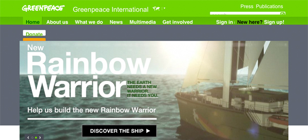
This is a case where usability and accessibility would benefit from fluid webdesign. If you look at the top right corner of the screenshot below you can see the top part of the search field. This container holding the search bar has a fixed “pixel” height. By simply replacing the pixel value with an “em” value the whole area is scalable and therefore remains usable even after increasing the font size. You could certainly also remove the height altogether which might be eventually even better as elements can fall without restriction.
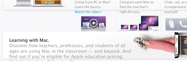
But the Greenpeace website is not a special case – many other prominent websites would fail this test. If you find the text on the apple website hard to read you will notice that it's mostly not scalable. Once you find a bit of text that is scalable it completely breaks the layout and is not readable any more.
The drop down menu
The main navigation of the site uses a “dropdown menu”. While some Usability experts argue that dropdown menus are a bad choice altogether it is important to test them with increased font size at least.
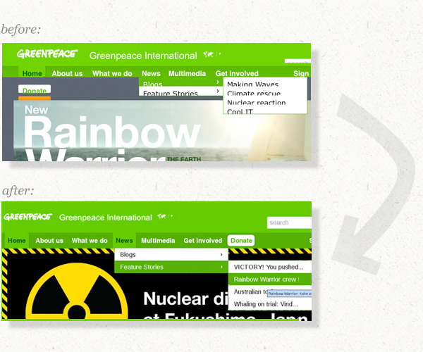
These issues can be also fixed by replacing all pixel heights with em values. Using a “user script” I edited the CSS of the website. If you have Firefox you can also test the changes on the live site by downloading the user script and the “grease monkey” addon.
The solution applied to the live site
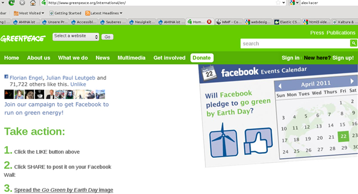
As you can see the search bar is now usable and scales with along with the other text. Also the menu and the dropdown menu is still accessible.
Hold on a second, will you?
At this stage you might think that people don't resize the text that often. While this might be true users don't necessarily have to consciously make this choice. Looking at the different screenshots in this article you might have noticed that those taken on a mac have a different font size than those on my netbook. The reason is that operating systems, browsers and devices have an impact on the way text is displayed on websites.
It's not just the difference in size between “Arial” on a PC and “Helvetica” on a Mac. Many netbook and handheld devices squeeze more pixels onto their small screens. If you use “pixels” for the font size these pixels will simply look smaller on the netbook.
Summary
- No pixel “height”, “width” if not absolutely necessary – instead use ems and percent
- Size the text using em or percent, otherwise IE does not increase the text
- Make sure your background images are designed to allow scaling, use background colors along with background images
- Use CSS3 for all browsers that support it, provide acceptable fall-back for those that don't
For a better User Experience
The primary objective of webdesign
The objective of an interface is to serve users. Therefore the primary objective of webdesign is to meet user needs – regardless of the users' choices. Just like we have to accept the fact that some people use old browsers we have to consider that some users might not have a large screen. Our goal should be to get rid of all obstacles concerning the interface. One of these obstacles is the vertical scroll bar.
You think vertical scroll bars are annoying, don't you? Apparently most users do. If you resize the window looking at a static layout there is always a point where the vertical scroll bar comes in. The more you increase the font size (or zoom the entire page) the sooner this will happen.
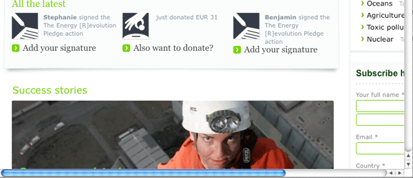
How large is your browser window?
Static web-design follows the myth that there is a standardized screen width designers can rely on. But the size of a screen is not what matters most. It's the actual area on the screen that displays a website. If your web analytics tell you that none of your visitors use a screen narrower than 930px that does not mean your visitors are not using browser sidebars or prefer to put their operating system navigation bar on side of the screen.
Your web analytics also don't tell you that I have a 26 inch wide screen and open up three different browser windows right next to each other. While this might be a scenario you will disregard with your design planning, it's a valid user choice.
How liquid is liquid design?
While there are websites with no minimum width at all you don't have to think about liquid websites as having no threshold. If it's elastic enough to be scaled between 750px and 1100px that's already great. While it's a lot of work to fully preserve static design elements when rebuilding a website to be liquid I only altered the most important parts of the CSS to make greenpeace.org elastic.
And what about the grid?
What really helps to fine tune the grid and some of the overall design according to different screen sizes is a tiny Java Script that determines the window width and adds a class to the body tag. Your design should be fully functional and pretty in the case that JS is switched off but to fine tune some elements this is a nice solution.
The least elastic elements
One of the problem zones is content with a determined width such as images and videos. But even those can be designed to be flexible. In modern browsers you can use percent to determine the width of an image. If you resize the browser window you will notice that the images in this article scale along with the window. For those browsers that don't support this (e.g. IE6) you can either crop images by putting them in a container that scales (and hides the overflowing element) or use Java Script to accomplish the resizing.
Videos are in some ways harder to deal with. Flash is a problem in webdesign in many ways. Therefore it's best to use modern HTML standards whenever the browser supports it and only go back to using flash for older browsers. There are a few interesting projects allowing you to simply embed one video and according to browser support uses will see and HTML 5 video, a Java Script video player or a flash video player.
Sometimes you are lucky and the width of the flash video is set to “auto” (which means it automatically adjusts to the container it's placed in). In that case you can design the container to scale along with the rest of the site and video will change too.
Lessons learned:
- It's hard to maintain a fluid grid system if it's planned to be a static grid
- Think carefully about using images, videos and flash objects
- Images (resize with JS, float nicely) & videos (HTML5, fall-back)
- Java Script to determine current window width
Webdesign for handheld devices and progressive enhancement
The plan B
Quite some time ago progressive enhancement was about stuff that seems basic to us these days. Why not use external style-sheets rather than mix HTML and CSS in a single file? But the same philosophy is applicable to a range of practices like the usage modern standards (CCS3 and HTML5) or the text-resizing behavior of various browsers.
Using progressive enhancement means you can have new and awesome technologies while still providing a plan B. What does it do to your design to increase the font-size by 150%? What's your plan B design for a 300px wide browser that has Java Script disabled and all media queries fail? The major goal should be make sure the content and the functionality of the site are still fully accessible.
Designing with multiple screen sizes in mind automatically leads to a layout that is also accessible in a wide range of other situations where fixed designs fail. For an example resizing the text usually doesn't break fluid layouts.
What the future might bring
This philosophy is especially interesting when thinking about handheld devices. The amount of different mobile phones people use to browse the web is staggering. While you might be able to optimize your website for the most relevant ones and provide them with a shiny mobile site you will not have the time and budget to optimize for every phone and tablet. Especially when taking future devices into account this might turn out to be expensive. These visitors using a device your site is not optimized for could still have an acceptable experience.
When applying liquid design practices your website will shrink and squeeze until it fits on a mobile screen. It might not look stunning and provide a mobile optimized interface but it can be at least accessible and usable.
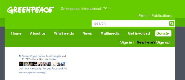
Adding the missing... something
Such a site is also a great starting point for a fully optimized mobile site. You can use Java Script, media queries or detect the User Agent to filter the content loaded on the site. If the process is successful you can then add classes to your tag to optimize the look and interface of the site.
Starting with the site you can see in the image on the right you only need to add a media query and some CSS to make it look like this:
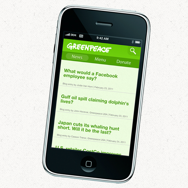
Why not a separate site?
One of the advantages of a single website (optimized for mobile too) is the maintenance work you save. Instead of having two completely separate systems you have all your content in one. The only thing that changes with the device viewing the site is the way the content is presented.
Another good reason to opt for this solution is the fall-back. With a completely separate mobile site the visitors whose device can't cope with media queries get the full static 930px wide website delivered to their screen. Aside the fact that it's probably not possible to navigate on the site on small screens at all it will be very hard to read the copy.
Final words
The big conclusion is...
Designing websites in a liquid fashion is definitely more work. It's the layered fashion of progressive enhancement and paying attention to detail which turns an "ok" website into a great site.
I want to encourage you to browse websites differently. I want you to visit all those websites that you think are great and give them a decent test. Increase the font size, see how different browsers behave and resize the window. If you think that's boring you might have wasted a lot of time reading this case study. But you can still hire me to do these tests for you.
Did I mention that this is biased?
Spending a lot of time thinking about liquid design problems and adequate solutions it may seem a little bit obsessive to you. While I'm certainly biased I know that there are many other perspectives on webdesign related problems and I am happy to have a chat with you about them.
Feel free to give me a tweet, send me an email.
